Those involved with assessment and information visualization often try to get to the “nirvana” of a single number that wraps everything of interest into one. Sometimes, that just isn’t sufficient.
The traditional line graph below shows how China is catching the United States in total Gross Domestic Product (GDP). If you have a subscription to the Economist (or haven’t reached your limit of free views), the live version of this one even allows for some interactivity by incorporating exchange rate assumptions.
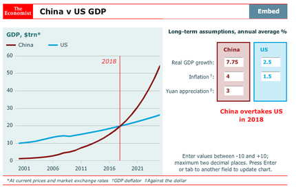
The takeaways from the visual above are essentially: (1) “Wow, the Chinese economy is going to be larger than the U.S. economy and (2) The Chinese economy has been growing faster than the U.S. economy for a few years and the growth is accelerating. Other versions I have seen online show that the crossing may occur sooner than had been previously forecast.
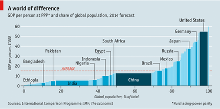
For comparison purpose, take a look at the graphic below. While it doesn’t get at the change over time, it does still show the relative size of the economies of China and the U.S. (and a number of other nations). It’s there, but hidden a little bit (think about the area of the rectangles). But, by dividing by population, it shows the GDP per person. In this metric, China is still below the U.S., Germany, Japan, Russia, Mexico, Brazil (and the world average). Interesting.